For this University project I was tasked with creating a rendition of Hilaire Belloc's Cautionary Tales For Children that was appropriate for adults. The existing book was designed for the 'Admonition of Children between the ages of eight and fourteen years',published in 1907. However, the book's satiric and humorous tone mores appeals to adults, hence our task to redesign the book in a way that would appeal to an adult audience.
This project was a group project which allowed me to gain experience working in a team to create a functional and effective book. Each member of the book had a role within the book, as follows:


I'm really impressed with our final outcome for this brief. As a group, we decided to utilise the creepy theme that was prevalent in the book, and decided to redesign the book with a slasher/horror twist. We focused on red and black for our primary colours to emphasise the slasher aesthetic, as well as creating our characters as adults instead of children to align our book with the typical themes of the slasher genre.
Below I have includes the elements of the book that I individually created within the group.

Title page typography

Title Page Typography: Algernon - 'Who played with a Loaded Gun, and, on missing his Sister was reprimanded by his Father'
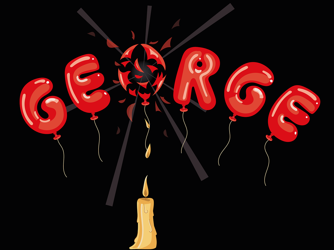
Title Page Typography: George - 'Who played with a Dangerous Toy [a balloon], and suffered a Catastrophe of considerable Dimensions'
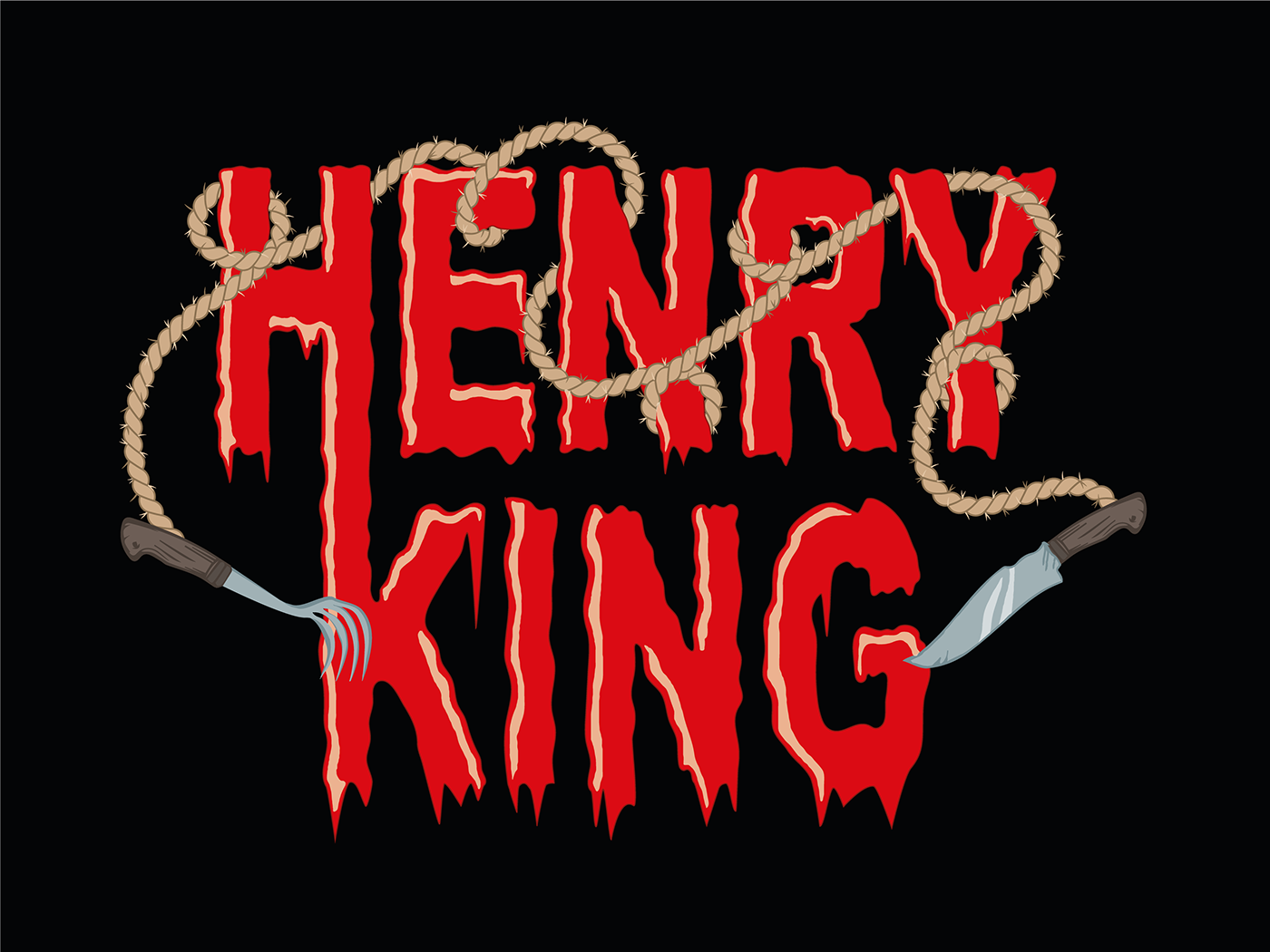
Title Page Typography: Henry King - 'Who chewed bits of String, and was early cut off in Dreadful Agonies'

Title Page Typography: Matilda - 'Who told Lies, and was Burned to Death'
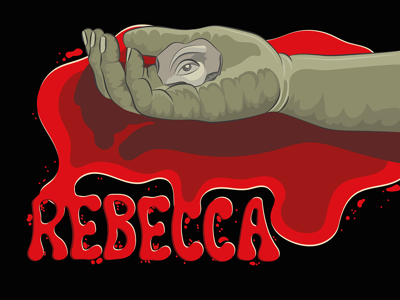
Title Page Typography: Rebecca - 'Who slammed Doors for Fun and Perished Miserably'

Back Cover: Blood splatter to hold the blurb